Notes
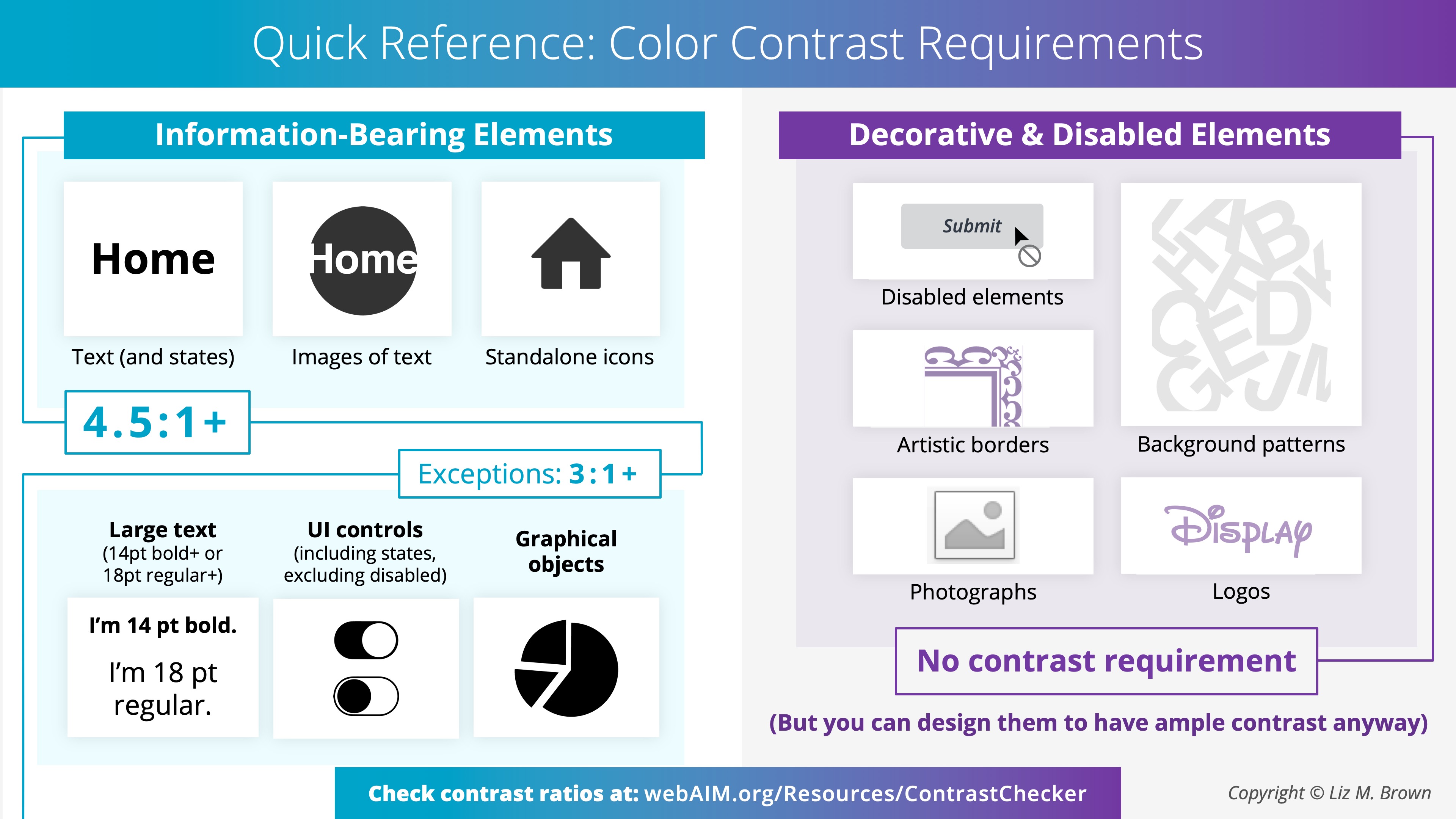
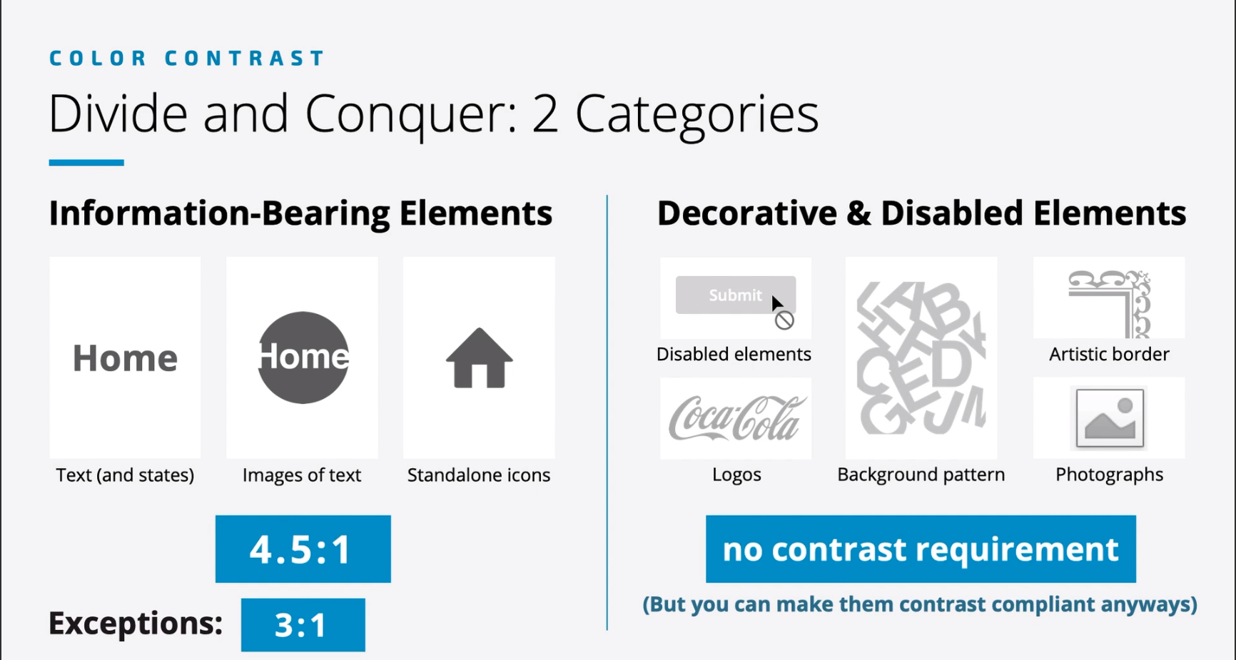
- There should be adequate contrast between color of the piece of the information in the foreground and color of it’s background.
- Good design needs sufficient contrast between foreground and background colors - not just in text but images, links , icons & buttons.

Color Contrast Vitals

- disabled elements should have some contrast making the elements visible to the user
- try to the maximum for accessibility and usability
Experience it : Red - Green / Blue - Yellow / No Color
- Types of color blindness :
- Red - Green
- Blue - Yellow
- Complete color blindness
- Red - Green very common
- Top color combos to avoid :
- Red and green
- green and brown
- green and blue
- blue and gray
- blue and purple
- green and gray
- green and black
Related
References
- Web Accessibility Perspectives: Colors with Good Contrast - YouTube
- Colors with Good Contrast | Web Accessibility Initiative (WAI) | W3C
- 10 Awesome World Government Design Systems and UI Kits | Codinhood
- Accessibility – Digital.gov
- Web Content Accessibility Guidelines (WCAG) 2.2
- Color and contrast accessibility | Articles | web.dev
- It ain’t easy seeing green | Perspectives | Sightsavers
- Chrome Web Store - Extensions
- Grayscale the Web - Save Sites
- Funkify – Disability Simulator
- Web Disability Simulator
- Silktide - website accessibility simulator
- Accessible color palette builder
- WebAIM: Contrast Checker
- Chrome Web Store - Extensions
- Understanding Success Criterion 1.4.11: Non-text Contrast | WAI | W3C